Responsive
Website
Design
DESKTOP TABLET MOBILE No Shortage of Fun
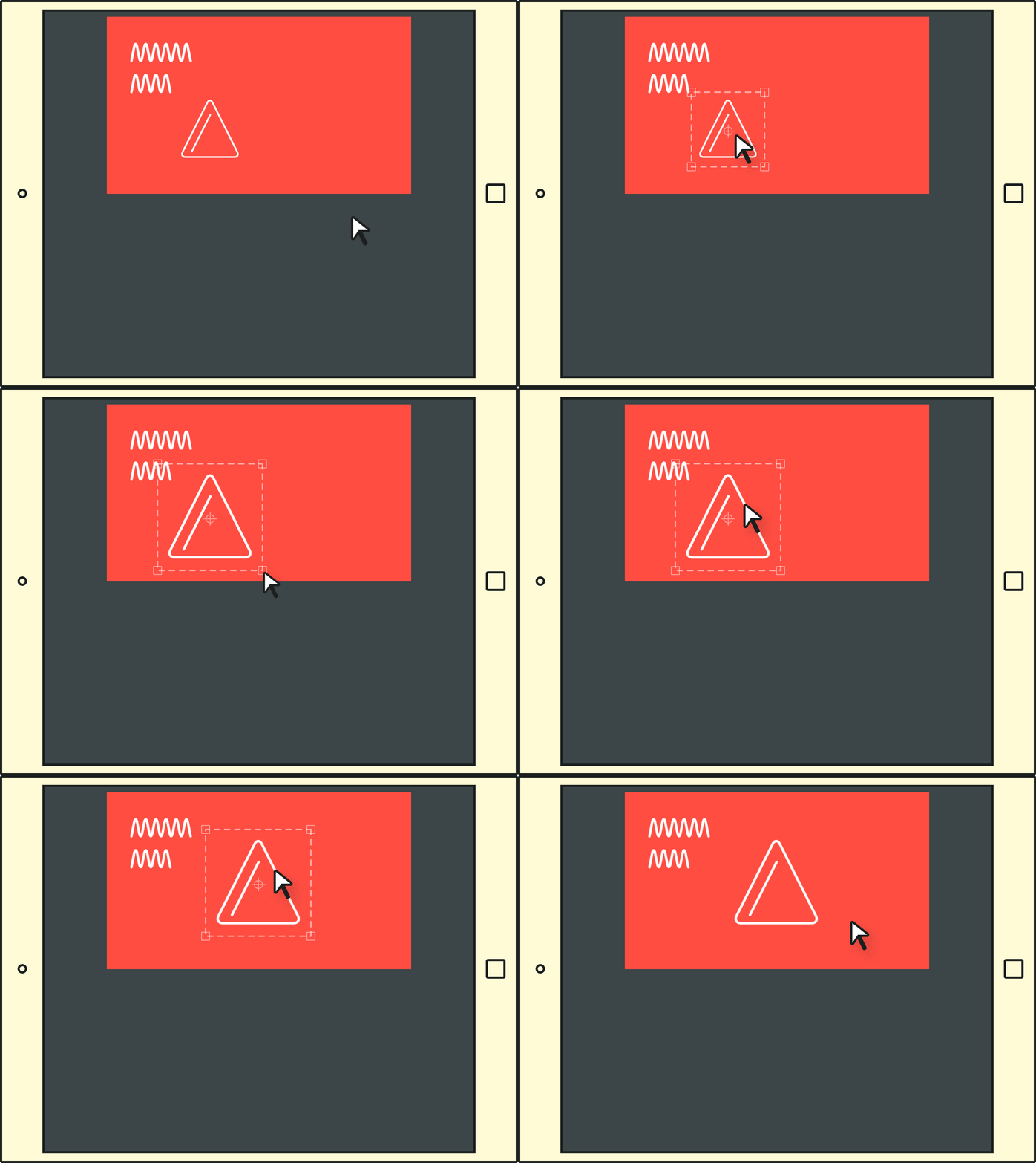
With larger screen sizes and more processing power comes increased capacity for additional features and functionality. As users will interact with your website on multiple platforms, progressively enhancing the experience can add value to your website.
No Auto-generation Here
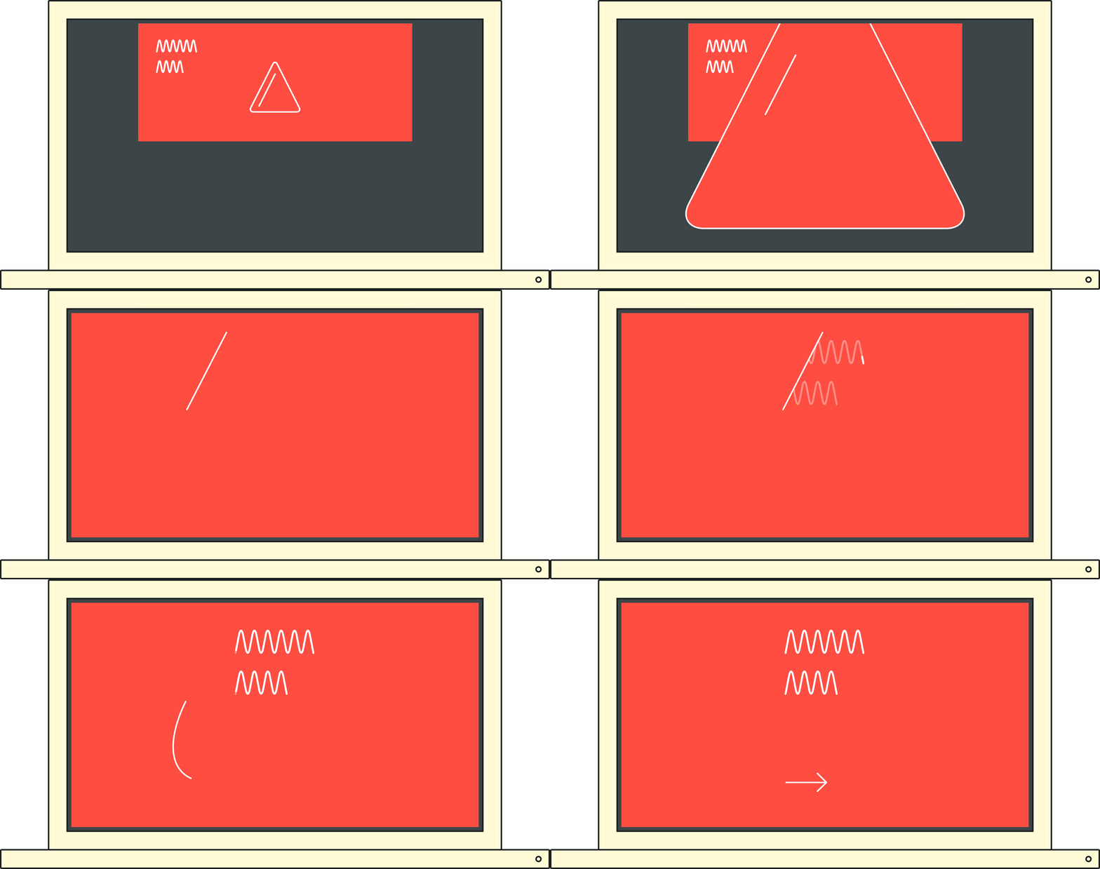
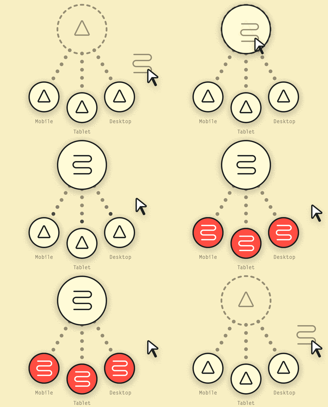
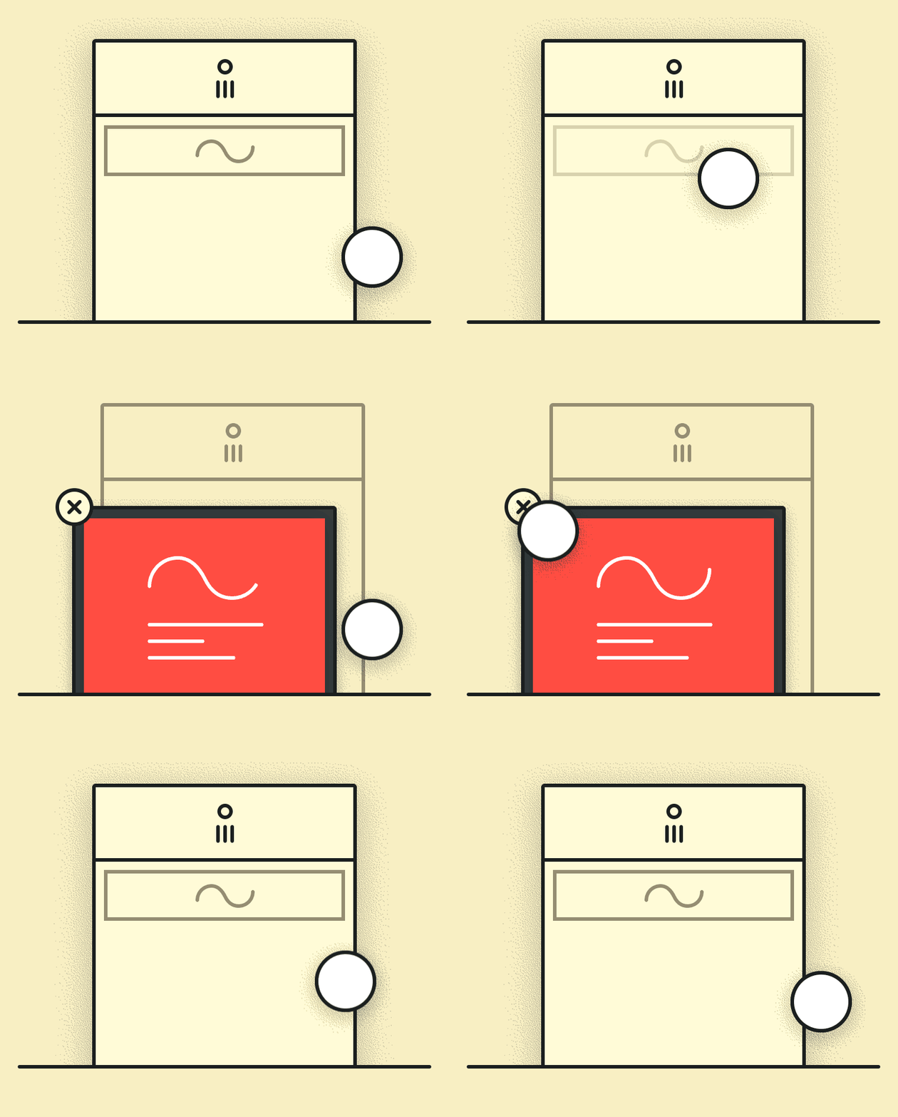
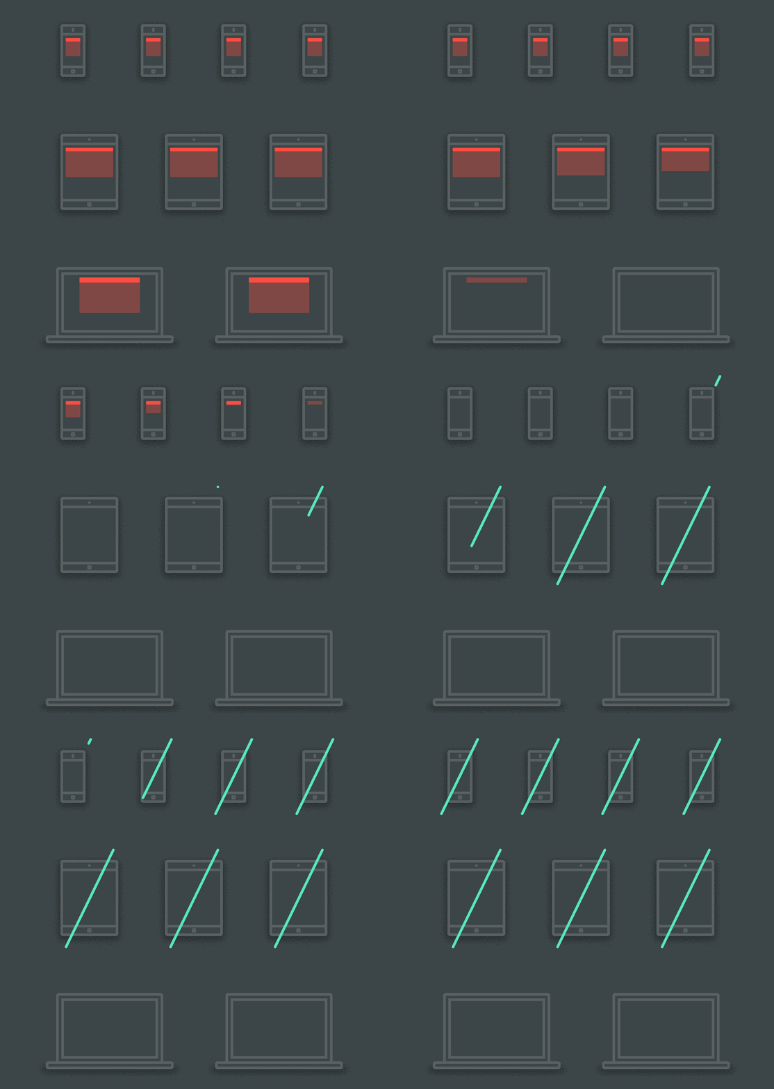
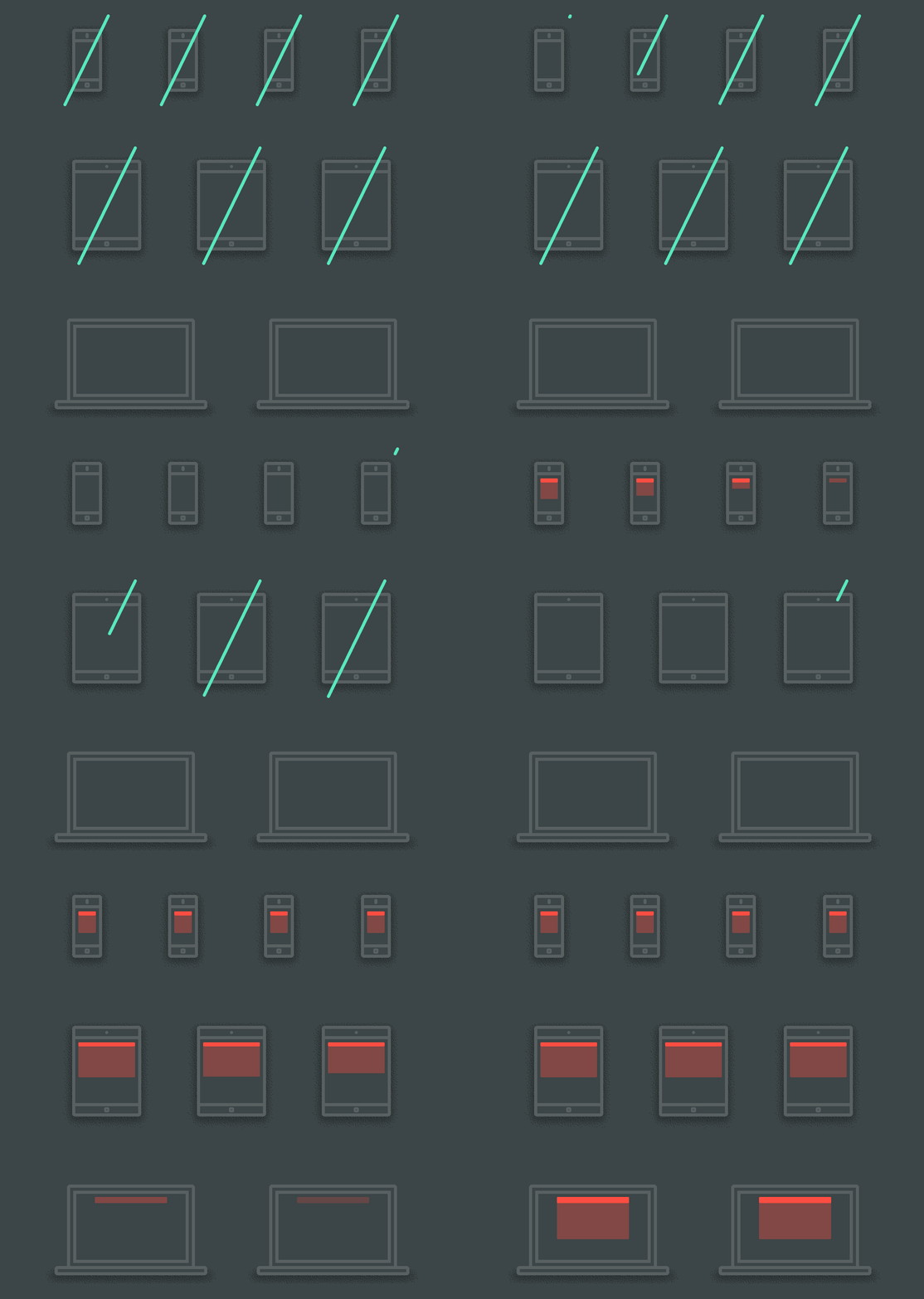
We don’t just let a computer decide where your website content get repositioned to, rather, we’ve pre-programmed the website to react to the browser's size. Your website experience will, therefore, always be fluid and intuitive.
Start With Mobile
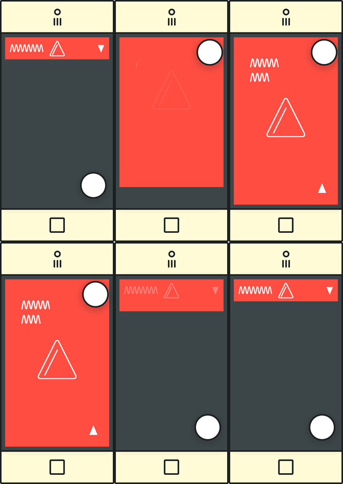
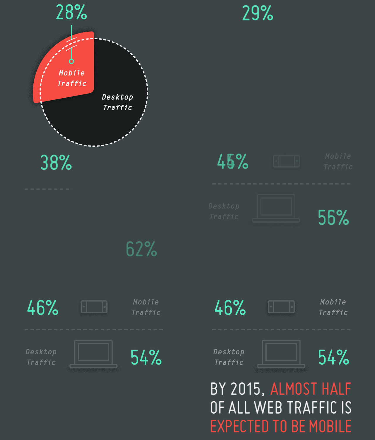
By starting with how your website looks, functions and feels on a mobile device, we ensure that your website is effective at the most restricting level. From there we're able to progressively enhance your internet presence as the website content increases and lives on a device with more processing power.
